Web designing has evolved with the advancement of technology. From very text-heavy and static websites in the beginning to fully responsive and dynamic websites; it’s an ever-evolving field of work. Similarly, with the advent of new and upcoming devices, web and app designers are always looking for innovative ways to bridge the gap between such devices because it is often challenging for such designers to cater to varying screen sizes while designing for optimal user experiences.
Responsive and adaptive designs are an answer to these problems. The ability to differentiate between these approaches allows us better insights and helps us attain our objectives with better results.
So, what exactly are responsive and adaptive designs?

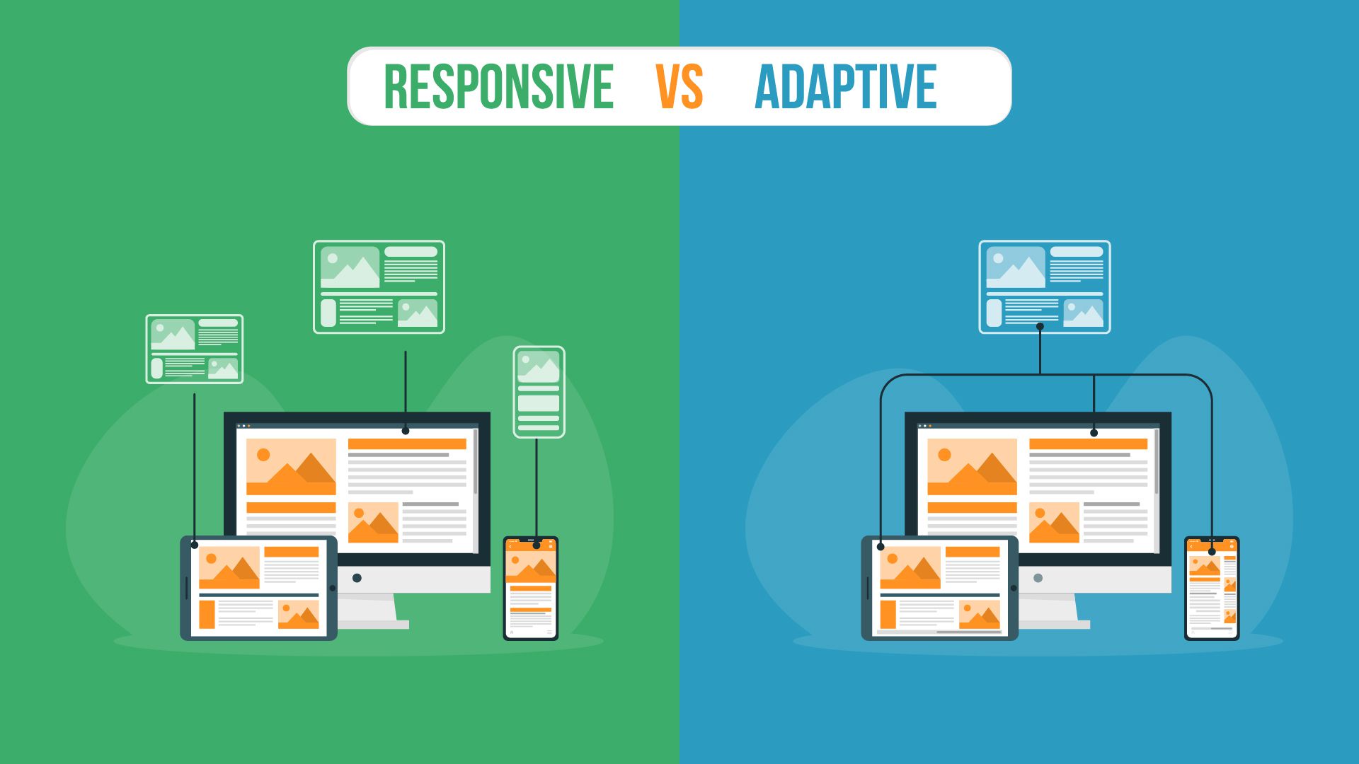
A responsive website design is often defined as being similar to water because of its fluid nature. It is a Graphic User Interface or GUI design approach built on flexible grids and uses the application of media queries after sizing up the elements to cater to varying screen sizes. With a responsive website design, the contents of a website can respond to its environment by adjusting the design elements in the available space. This design allows the automatic dynamic arrangement of elements in response to the changing screen sizes.
A less popular approach, also known as a progressive enhancement of a website, was introduced by Aaron Gustafson in 2011. An adaptive website design requires comprehensive planning. It is also a GUI design approach that adapts to varying screen sizes by using different static layouts based on breakpoints. It detects the size of the screen and unlike a responsive website design that uses available space to fit the elements, it selects the best layout for that size.
Resizing the browser does not have any impact on the design because of these multiple static layouts. In adaptive designing, designers commonly create six designs for the most common six screen widths. Although this design approach requires a lot more work, it looks like the perfect fit because of the customized display of multiple layouts for different screens.
Now that we have learned the differences between both adaptive and responsive designs, the next question is which one is the best and how to choose between them.
The first and foremost thing to consider is the requirements of the user. Always keep them in mind and identify their habits, the devices they commonly use, the sites that they frequently visit, the type of site that they desire (whether it’s a content-heavy site or some other), and other important considerations. Knowing these factors will help to determine the appropriate approach.
Time is another factor to consider when deciding upon the method to use. A responsive website design is always appropriate if you are short on time as it is easier to implement and requires less work. An adaptive design, on the other hand, requires more work, time, and effort.
SEO is another factor that impacts the decision. A responsive website design is more SEO-friendly compared to an adaptive website design. A responsive website increases usability and therefore helps improve search engine rankings.
If you want the best user experience, then adaptive design is the best choice. It offers customized solutions and translates the users’ needs into reality. It is important to remain in tune with the users’ needs by designing user-friendly interfaces. Adaptive website design takes an edge over responsive design when it comes to user experience.
Introduced in 2011, adaptive website design takes a more modern approach by focusing on mobile phones, whereas a responsive design is more desktop-centric. With the advancement of technology, smart devices have almost taken over desktops and with this advancement, the adaptive design seems more appropriate with its focus on modern user experience.
If you want a website that can generate traffic from other platforms, then look no further! Optimization of advertisements is yet another factor that makes adaptive designing a more appropriate choice. It allows you to address user-specific needs.
If you want your website to have less load and download time, then adaptive website design should be your preferred choice. Adaptive websites are said to be 2-3 times faster than responsive websites and this can get you a huge advantage over your competitors.
An adaptive website design requires a lot more work compared to a responsive design because of its multiple fixed layouts. It also requires professionals to design and implement it due to its complex nature. Whereas, a responsive website design has a single URL and only uses media queries to make the website responsive.
Both adaptive and responsive website designs have their advantages and disadvantages. It is important to check these pros and cons in detail and keep the user requirements in mind. Many factors make them comparatively better than each other; it all depends on the needs and requirements of the user. So, to answer the question as to which one is the best, there is no definite answer because it all depends on the users’ needs.
While adaptive design can provide the best user experience, it falls short when it comes to SEO. In a similar way, a responsive design is more SEO friendly and requires less work but it falls short when it comes to loading time. Therefore, if you are looking to drive organic traffic from search engines, then it is best to contact an expert to provide responsive web design services.

The Palette Digital brings you the most amazing and professional creative services. We are here to revolutionize your businesses and work on creating a better and appealing outlook for your brand.
We believe in brand identity by creating innovative brand logos. We have professionals with substantial experience, skill and qualification. Our professionals guarantee the logo settles with the core business idea while working to boost the overall purpose of branding.
276 Fifth Ave Ste 704 PMB 140 New York, NY 10001
info@thepalettedigital.com
+1 (877) 893-3670
We Would Be Happy To Answer Your Queries.