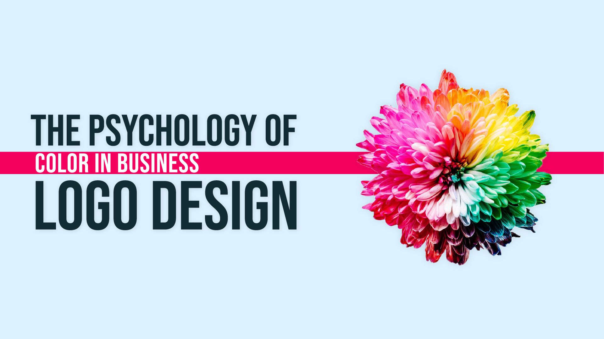
Logos are the most important marketing tool for any business. Every single business must put immense effort into its corporate logo design. When we look at the most successful and iconic corporate logos of all time, one thing we find common is that they all are made with intricately differentiating patterns based on color, vibe, font style, etc. While the purpose of all of them is to serve as a brand identity but they all are unique and define their respective businesses in the best possible way.
Another thing that greatly impacts the corporate logo design is its color. The thought behind this is quite profound and true to a larger extent as is seen. Colors play a visual game, the best colors make the logo win while the wrong choice can make you lose your logo game. Now let’s get into what we mean by the best colors for your corporate logo.
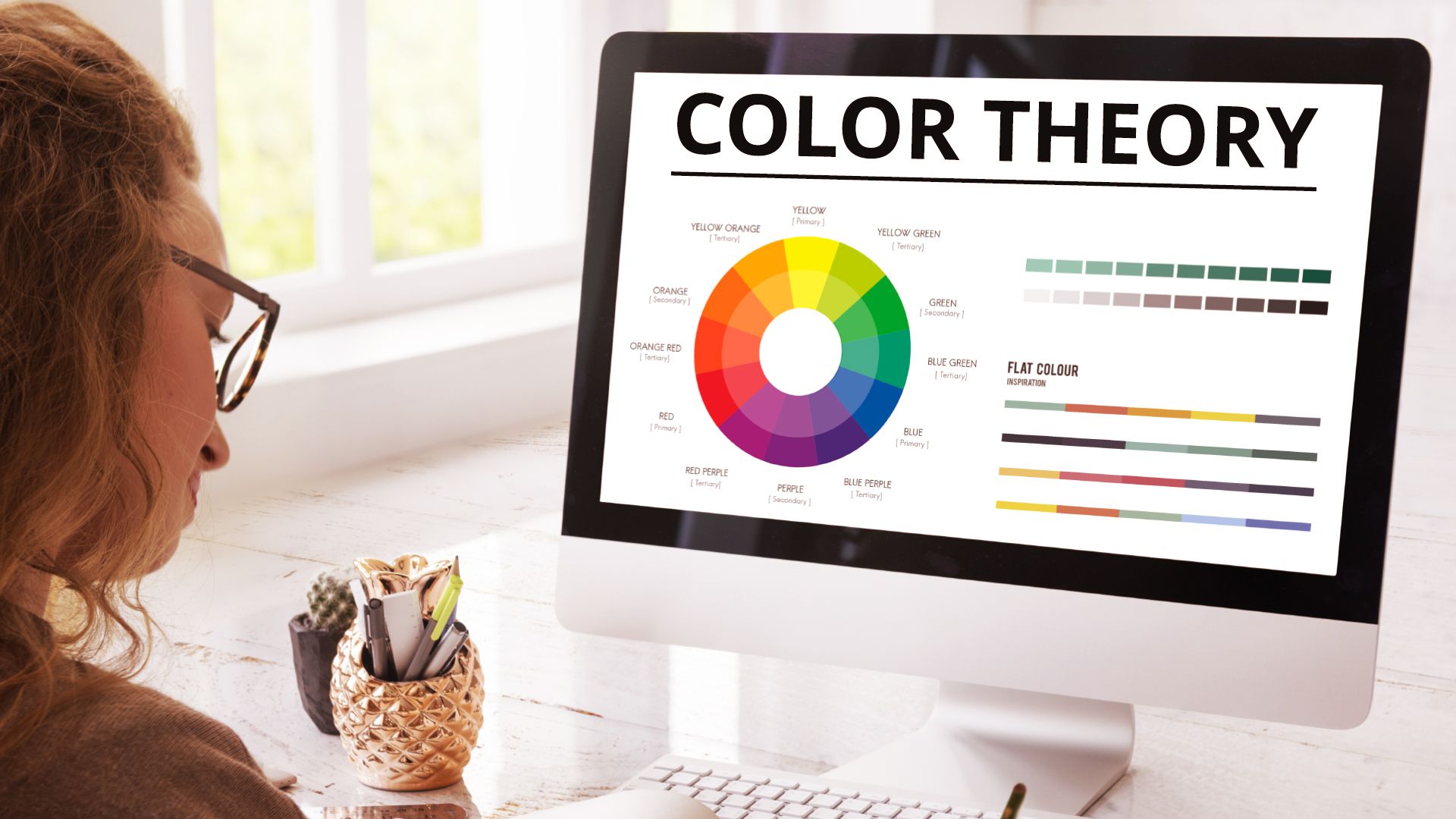
There is no black and white rule for deciding upon colors when you create a corporate logo. But there is a little concept to it that can definitely alleviate the level of your logo design to a professional logo design.
The concept is the “psychology” of colors. While you may have come across this term mostly related to human beings, here it serves “kind of” the same purpose. Psychology helps you in understanding human behaviors while the psychology of colors helps you in understanding the impact a certain color may have on human beings. Yes, you read that right. Colors “DO” have an impact on human beings. Our vision notices colors and we get affected by the colors we see, use, or wear. This can be a little mind-boggling but it's the utmost truth.
Another important thing to note here is that one color can signify various moods and behavioral impacts. Each color is not limited to one specific behavior. It can show a different type of impact in varying circumstances. Also when the colors are combined they show different impacts as well. This is the beauty of colors.
Learning psychology of colors can be something ingenious but it can do wonders for your quintessential corporate logo. Let’s take a look at a few colors and their impact on human behaviors!
The blue color is said to have soothing and calming effects. The sense of contentment that radiates from blue color-sea, ocean, sky all radiate that and that is what blue color is said to communicate as well. Facebook, Unilever, Twitter, Skype, Samsung, Hp, Gap, etc. all have their logos in blue. What’s important to understand is that they all are different types of brands offering different types of products so the reasons for selecting the color are not unifying. It’s definitely the fact that each brand decided what their respective business vibe should be and when they thought it aligned well with the color blue, they opted for blue.
The green color is known for giving a fresh impact. Fresh, rejuvenated, and environmental care is reflected through it. Green is all about nature and natural things beholden. The stillness and serenity are best epitomized through this color. Starbucks, Lacoste, Tic Tac, Android, The Body Shop, and Land Rover are a few famous brands to have their corporate logo in green. Once again we see diversity in the brands opting for green which reinforces this detail that brands choose the color in the way they relate to it.
While Body Shop may have adopted the color to showcase its ethical concerns for biodiversity on Earth. It produces cruelty-free products showing care for environmental beings. The reason why Starbucks chooses it can be symbolic for positive and good relations with all people-primarily towards their customers, consequently contributing to making a positive and refreshing environment.
Red color can reflect danger. It is also perceived as the color to reveal something important, to highlight, and to make things bold. Coca-Cola, YouTube, CNN, and ESPN are some famous brands using red color. The psyche behind using this color in their corporate logo can have various reasons. While CNN being a news channel highlights its importance through the color red- giving important and urgent news at the right time. Coca-Cola uses it because the bold red impulses consumers to buy their product. Red is also used to exude power and enigma. The color is provocative and attention-grabbing.
Orange color demonstrates fun, chilled, and laid-back vibes. Adventures, fun-filled things are correlated with this color usually. Nickelodeon, Fanta, SoundCloud, Firefox all use orange in their corporate logos and their respective brands also display similar vibes in their own creative ways. These brands highlight how they are fun and inclusive for everyone. The color makes the brand seem approachable to everyone regardless of who they may be.
The color of happiness and friendship. The one that gives happy-go-lucky vibes. McDonald’s, Shell, National Geographic Channel all have yellows in their corporate logo. The psychology behind this can be that yellow can be added to any logo design to add in the essence of amiability and relationship building.
As we mentioned before how colors can have a different and added effect when they are combined, here we can see McDonald’s having that effect when it's combined with red color. While red being assertive in showcasing hunger and impulsiveness and yellow showcases the “happy meal” and the joy obtained from getting Mcdonald’s. Both colors together play the perfect mix for McDonald’s corporate logo design, making it one of the most iconic and recognizable logos of all time.
Color reflects peace, positivity, kindness, and calmness. It also emancipates purifying and liberating essence. White comes in the category of neutral. It’s added in logos to give subtlety and is usually used in combination with other colors such as in the National Geographic Channel Logo. While Yellow displays care for the environment, white in the logo adds to that notion. White in Uber’s logo also showcases the efficiency of the ride-hailing service. Similarly white is also used in WWF’s & Pfizer’s corporate logos, reflecting its essence of a serene and healthy environment.
Such is the impact of color psychology on corporate logos. We hope you have learnt the psychology of the colors mentioned and will be able to use suitable colors to design a corporate logo that suits your overall brand identity.
The Palette Digital brings you the most amazing and professional creative services. We are here to revolutionize your businesses and work on creating a better and appealing outlook for your brand.
We believe in brand identity by creating innovative brand logos. We have professionals with substantial experience, skill and qualification. Our professionals guarantee the logo settles with the core business idea while working to boost the overall purpose of branding.
276 Fifth Ave Ste 704 PMB 140 New York, NY 10001
info@thepalettedigital.com
+1 (877) 893-3670
We Would Be Happy To Answer Your Queries.