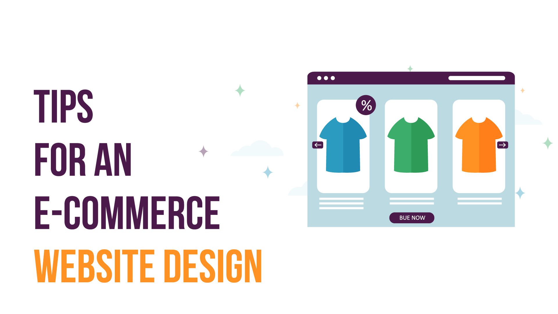
During frequent visits to the mall or out on an evening walk, we are often compelled to visit many a store because of their storefronts. A website is similar; it is the storefront of your business, and just like any walk-in store’s storefront, it should be equally attractive to generate more customer traffic.
You might have ample products and a good business, but if your website is not attractive, your business is not going to get any attention. The majority of people judge things based on what they see and the first impression always remains with them. Your e-commerce website design will determine your business’ value proposition and eventually your success.
Since an e-commerce website helps you build your brand, connects you with customers, and helps you generate more sales, a good design is critical for such a website. That is why today, we will be giving you some useful insights to help your business reach more customers.

End users should always be your priority. But how does one get to know what is going on in the user’s mind while designing a website?
Thinking like an end-user can help you connect with them. If you want your customers to connect with your e-commerce website design, there are a few things that you should keep in mind. Build your shop around your customers’ psyche and create the best shopping experience, so they keep coming back.
Your potential customers want certain things from an e-commerce website design such as easy navigation, smooth interface, easy purchase option, good product description, and a suitable color scheme. Also, try to connect with customers by engaging with them regularly and getting feedback on what they want. Customers will eventually notice how much work you are putting into customizing their experience, and this is one of the ways that can turn them into loyal consumers, which will help build your brand.
You might not believe it, but simplicity is always better. This is one of the cardinal rules that you should always keep in mind while designing your e-commerce website.
If you fill your page with unnecessary features (Pop-Ups, Ads, colors, etc.), it will only distract potential customers from your products, and they will most likely not buy anything.
Always keep your e-commerce website design simple, clear, and clean. Generating sales should be your focus, and a minimalist website is always more visually appealing than a complex one.
Colors should be an important factor in your e-commerce website design. They can alter or set the mood to attract or deflect attention. But this is not as simple as selecting your favorite color and being done for the day. Colors are a powerful tool, and you can use them to your advantage if you understand the psychology behind them.
Different colors have different meanings and effects. Their optimal use in your e-commerce website design can have a massive influence on your business. For example, stores add bright colors to purchase buttons to get their customers' attention.
The trend of web browsing has gradually shifted towards mobiles. People nowadays surf more on mobiles than on desktops. Many users will quickly lose interest if your website is poorly designed and requires a zoom function to see your content. Your e-commerce website design should be mobile responsive if you want to attract customers.
A good website builder can help you convert your e-commerce web design into mobile templates. A responsive e-commerce web design will adapt to any device, and you will not have to worry about making separate versions for various devices.
An e-commerce web design is meaningless without photos. They are an integral part of the website and impact customers’ buying behavior. Online shoppers need to see what they are buying, and images are the only way they can do that.
Poor quality images will go a long way in deflecting the customer. Your e-commerce website design should have high-quality photos of your inventory. Take multiple shots of each product and create a slideshow, so users can see the product from every angle. Also, using lifestyle pictures of people interacting with products attract more customers. For example, an article of clothing worn by a model will be more appealing than being displayed on a mannequin.
Good quality images make customers more confident about their purchase decision, while poor quality images make them hesitant, resulting in the loss of customers as a result.
Internet users have short attention spans, and research proves that they only read about 20% of the text on any web page. They don’t spend too much time trying to decipher your business; they are there to shop, and large blocks of texts serve as distractions for them.
Keep the content of your e-commerce web design scannable to attract customers. Avoid putting large chunks of information, and try to break your product descriptions, about us information, and even blog posts into an easy-to-scan format. You can make your content scannable by using brief paragraphs, bulleted or numbered lists, multiple header sizes, and images.
The more scannable your content is, the more convenient for customers to get the key message. This, in turn, will generate more sales.
Navigation is one of the most important elements in an e-commerce website design. Nothing deflects customers faster from a virtual store than a difficult-to-navigate product page. Customers don’t have the time to click on multiple options from different menus to find their desired product.
Your e-commerce web design should make navigation easier for your customers. It would be best to divide your products into categories and further filter them by different options such as color, size, or product type. This categorization will make it much easier for customers to navigate your website, and it will be easier for them to make a purchase.
A complicated checkout process can make you lose valuable customers. If you want to keep them, then make the process of purchasing as hassle-free as possible in your e-commerce web design. There are certain ways to simplify a checkout process.
The checkout page design should be clean, simple, and easy to navigate. Customers like it when you give them the option of checking out as a guest. Too many questions during the registration process can also make them suspicious. Make the checkout process as transparent as possible and clearly define everything; the information needed to process the purchase, the different available shipping options, their cost, and information about what they need to do if they want to return an order. Making the checkout process easier will make more people buy from you.
Statistics confirm that 61% of the customers tend to read reviews before buying a product. It is a quick way to build customer trust and promote sales.
A good e-commerce website design strategy is to show your potential customers positive feedback and ratings for your product. You can also add a testimonial section featuring customers' photos and quotes about their experiences with you. Feedback and ratings will make you appear trustworthy and will make your conversions go up.
Transparency is crucial when it comes to any business. Lying is futile on an e-commerce website. Always try to avoid hidden fees and be honest about the product prices on your e-commerce web design. Deceit will not only lead to customer loss, but it will also lead to a loss in your brand reputation.
An e-commerce website design can always be tricky. A well-designed e-commerce website can elevate your business. There are many e-commerce website design services available to help you set up your website. We hope that these tips can help boost your business.
276 Fifth Ave Ste 704 PMB 140 New York, NY 10001
info@thepalettedigital.com
+1 (877) 893-3670
We Would Be Happy To Answer Your Queries.
